Making things glow and shine with SwiftUI
While scrolling through Twitter recently, I came across this timer animation. What caught my eye in it was the movement of the border around the element. In this article, we will try to replicate this effect using SwiftUI.
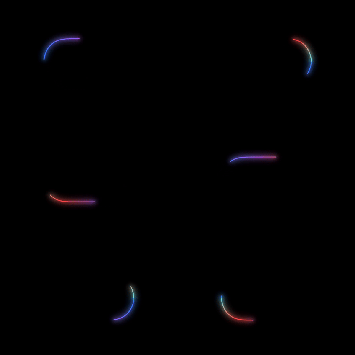
Glow in the dark
The first thing we’ll do is to figure out how to create a glow around the border. Conceptually, the view is built from several layers: a layer with the main fill and a layer with the blur.
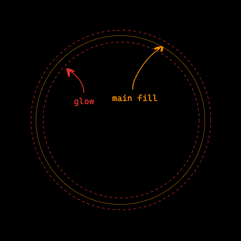
To build the form, we will use the Shape protocol and its stroke method, which allows us to get a shape stroke. Through this method we specify the width of the stroke to make it visible. For now leave the fill orange for the sake of clarity.
Circle()
  .stroke(lineWidth: 2.0)
  .fill(.orange)
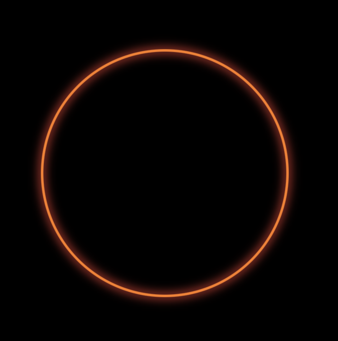
The next step is to add the glow. Through overlay we repeat the stroke, this time adding the blur modifier and specifying the blur radius. More radius means more blur. For this layer, the width of the stroke is twice the width of the original layer, so that the blur starts outside the main stroke.
Circle()
  .stroke(lineWidth: 2.0)
  .fill(.orange)
  .overlay {
    Circle()
      .stroke(lineWidth: 4.0)
      .fill(.red)
      .blur(radius: 4.0)
  }
The result is a sketch for the Dune trailer. To increase the saturation of the blur, one can combine overlays with different radius and width.
For convenience, let’s add an extension to Shape. Among the important things to note here is the fill parameter, which is of type ShapeStyle. This protocol is implemented by different fill structures, such as Color and Gradient.
extension View where Self: Shape {
  func glow(
    fill: some ShapeStyle,
    lineWidth: Double,
    blurRadius: Double = 8.0,
    lineCap: CGLineCap = .round
  ) -> some View {
    self
      .stroke(style: StrokeStyle(lineWidth: lineWidth / 2, lineCap: lineCap))
      .fill(fill)
      .overlay {
        self
          .stroke(style: StrokeStyle(lineWidth: lineWidth, lineCap: lineCap))
          .fill(fill)
          .blur(radius: blurRadius)
      }
      .overlay {
        self
          .stroke(style: StrokeStyle(lineWidth: lineWidth, lineCap: lineCap))
          .fill(fill)
          .blur(radius: blurRadius / 2)
      }
  }
}
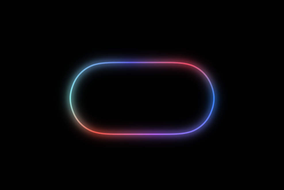
Let’s try to put the described elements together. Let’s use AngularGradient type as a fill.
Capsule()
  .glow(
    fill: .angularGradient(
      stops: [
        .init(color: .blue, location: 0.0),
        .init(color: .purple, location: 0.2),
        .init(color: .red, location: 0.4),
        .init(color: .mint, location: 0.5),
        .init(color: .indigo, location: 0.7),
        .init(color: .pink, location: 0.9),
        .init(color: .blue, location: 1.0),
      ],
      center: .center,
      startAngle: Angle(radians: .zero),
      endAngle: Angle(radians: .pi * 2)
    ),
    lineWidth: 4.0
  )
extension ShapeStyle where Self == AngularGradient {
  static var palette: some ShapeStyle {
    .angularGradient(
      stops: [
        .init(color: .blue, location: 0.0),
        .init(color: .purple, location: 0.2),
        .init(color: .red, location: 0.4),
        .init(color: .mint, location: 0.5),
        .init(color: .indigo, location: 0.7),
        .init(color: .pink, location: 0.9),
        .init(color: .blue, location: 1.0),
      ],
      center: .center,
      startAngle: Angle(radians: .zero),
      endAngle: Angle(radians: .pi * 2)
    )
  }
}
Animating the things
The next step is to animate the path. To draw a specific section of the path, we will use the trim modifier. It accepts two parameters - the beginning and the end of the path, expressed as a fraction accepting values in range of 0.0 and 1.0.
struct ContentView : View {
  @State private var progress: Double = 0.0

  var body: some View {
    Capsule()
      .trim(from: .zero, to: progress)
      .glow(
        fill: .palette,
        lineWidth: 4.0
      )
      .onAppear() {
        withAnimation(
          .linear(duration: 2.0)
          .repeatForever(autoreverses: false)
        ) {
          progress = 1.0
        }
      }
  }
}
To control the progress of drawing, we define the progress property and pass it as a parameter to endFraction. The animation is defined explicitly through the withAnimation block, specifying that it will be repeated indefinitely. In its block change the value of progress to 1.0.

Right now the animation looks choppy, with the start of each new cycle it resets the progress of the previous cycle, causing the drawn segment to disappear. Let’s fix this by adding control over the beginning of the path as well.
We will calculate the value of the startFraction parameter based on the current progress. Let’s define a constant delay with the value of 0.2, which will determine the delay before the start of the segment starts moving.
If the progress is greater than the delay - we return their difference, which will create a plume effect. In other cases we leave the beginning at zero fraction.
.trim(
  from: {
    if progress > delay {
      (progress - delay)
    } else {
      .zero
    }
  }(),
  to: progress
)
The segment has moved and now looks something like a snake. But it still disappears when the animation starts again. This is because by the end of the animation, the beginning of the segment does not have time to coincide with its end.
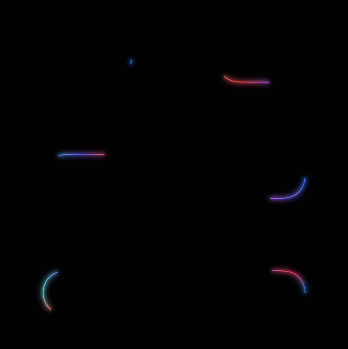
Let’s fix this by adding another condition to the formula: when the animation comes to an end, we assign the beginning of the segment to the values on the back side of the end.
.trim(
  from: {
    if progress > 1 - delay {
      2 * progress - 1.0
    } else if progress > delay {
      (progress - delay)
    } else {
      .zero
    }
  }(),
  to: progress
)
We start it up, and… nothing happens. Why?
The problem is that the condition we added returns a value greater than progress after the animation starts, which makes SwiftUI (specifically trim and the Capsule implementation) unable to interpolate intermediate values for the animation. What happens is that at the current view level, the formula only accepts two progress values:
0.0, which comes in at the view creation stage as the default value1.0, which we set in thewithAnimationblock.
To be able to work with intermediate progress values in the formula, we need to implement the Animatable protocol.
Let’s define a new view to which we will transfer the stroke structure.
struct ProgressView: View, Animatable {
  var progress: Double
  private let delay = 0.2

  var animatableData: Double {
    get { progress }
    set { progress = newValue }
  }

  var body: some View {
    Capsule()
      .trim(
        from: {
          if progress > 1 - delay {
            2 * progress - 1.0
          } else if progress > delay {
            (progress - delay)
          } else {
            .zero
          }
        }(),
        to: progress
      )
      .glow(
        fill: .palette,
        lineWidth: 4.0
      )
  }
}
By conforming the view to the Animatable protocol, we must implement the animatableData property. It allows us to tell SwiftUI which values should be interpolated. In our case, it is progress.

Moving on
In the original animation, the length of the segment is constant. One option is to animate two segments at once, but each only halfway through.
So, when the first segment reaches its end point (half of the total path), the animation for the second segment starts. And when the second segment reaches its end point, the animation for the first segment starts. And so on in a cycle.
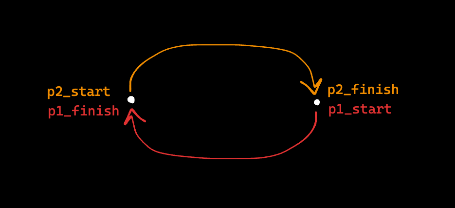
Let’s start by modifying the formulas in trim.
For the beginning of the segment, we will leave only the calculation of the loop. For its end, we will set a restriction: if the progress is more than half, then we hold the end of the segment at one value, otherwise we move it with the progress.
.trim(
  from: {
    if progress > delay {
      progress - delay
    } else {
      .zero
    }
  }(),
  to: {
    if progress > 0.5 {
      0.5
    } else {
      progress
    }
  }()
)
In the first half of the animation the segment is drawn and disappears, in the second half it is not drawn because of the set limit for the stroke end.

In ContentView we will add a second instance of ProgressView, but rotate it 180 degrees so that its start point coincides with the end point of the first instance.
We will also define a separate progress counter for it in progress2. Its corresponding withAnimation block will start with a delay of half the animation time (1 second in the example), so that the first segment has time to reach its end.
struct ContentView: View {
  @State private var progress1: Double = 0.0
  @State private var progress2: Double = 0.0

  var body: some View {
    ZStack {
      ProgressView(progress: progress1)
      ProgressView(progress: progress2)
        .rotationEffect(.degrees(180.0))
    }
    .onAppear() {
      withAnimation(
        .linear(duration: 2.0)
        .repeatForever(autoreverses: false)
      ) {
        progress1 = 1.0
      }
      withAnimation(
        .linear(duration: 2.0)
        .repeatForever(autoreverses: false)
        .delay(1.0)
      ) {
        progress2 = 1.0
      }
    }
  }
}

Conclusion
Using this approach, you can create a glow effect for any type that implements the Shape protocol. For example, we can recreate Apple’s “Hello” greeting using Path, but that’s for another time 😏
