Exploring spatial borders with SwiftUI
Today’s inspiration comes from a mix of the Flighty app and visionOS components. We will explore
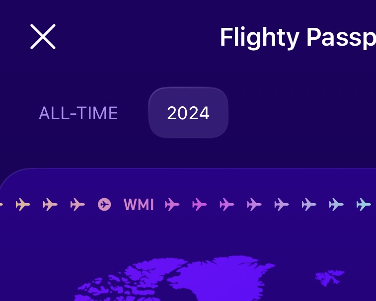
We’ll explore what tools provided by SwiftUI can be used to achieve this effect, playing with gradients, unit points, and strokes.
Hit the road
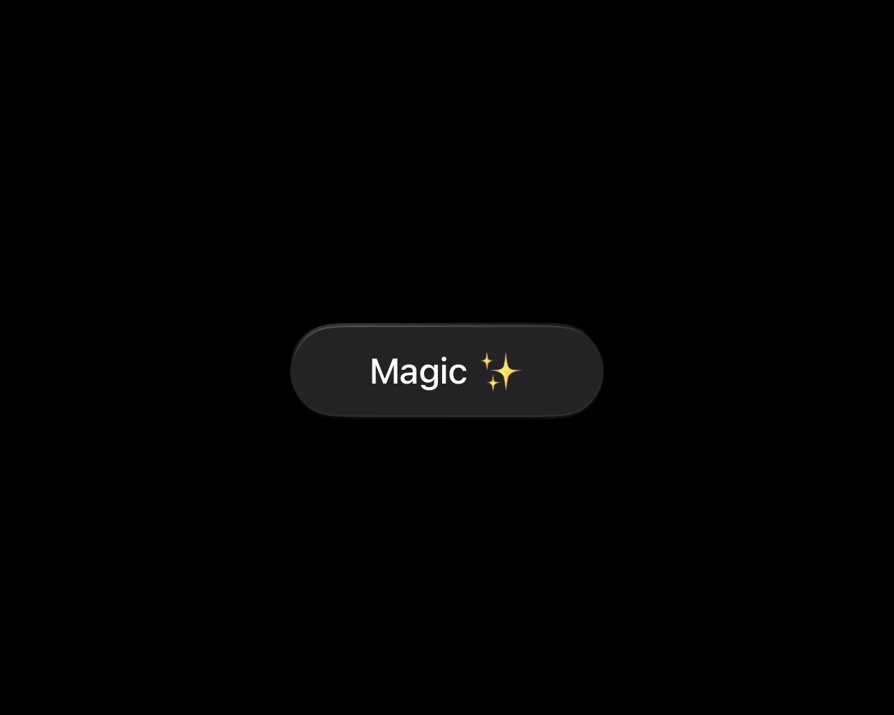
Start with the basic layout. You can choose dimensions and overlaying content whatever you want, further in the article we will mostly focus on the capsule component.
struct ContentView: View {
  var body: some View {
    ZStack {
      Capsule()
        .fill(.gray.opacity(0.25))
      Text("Magic ✨")
        .font(.system(size: 17.0, weight: .medium))
        .foregroundStyle(.white)
    }
    .frame(
      width: 150.0,
      height: 44.0
    )
  }
}
One of the possible options of adding a border is overlaying another shape with the stroke applied on it.
Capsule()
  .fill(.gray.opacity(0.25))
  .overlay {
    Capsule()
      .stroke(lineWidth: 2.0)
      .fill(.white.opacity(0.4))
  }
To make things a bit more joyful, replace a solid color with a gradient as a fill component.
.overlay {
  Capsule()
    .stroke(lineWidth: 2.0)
    .fill(
      LinearGradient(
        gradient: Gradient(stops: [
          .init(color: .white.opacity(0.4), location: 0.0),
          .init(color: .white.opacity(0.0), location: 0.4),
          .init(color: .white.opacity(0.0), location: 0.6),
          .init(color: .white.opacity(0.1), location: 1.0),
        ]),
        startPoint: .init(x: 0.16, y: -0.4),
        endPoint: .init(x: 0.2, y: 1.5)
      )
    )
}
Here values for starting and ending points are taken to match the visionOS design a little bit. Anyway, let’s discuss what they mean.
Units and colors
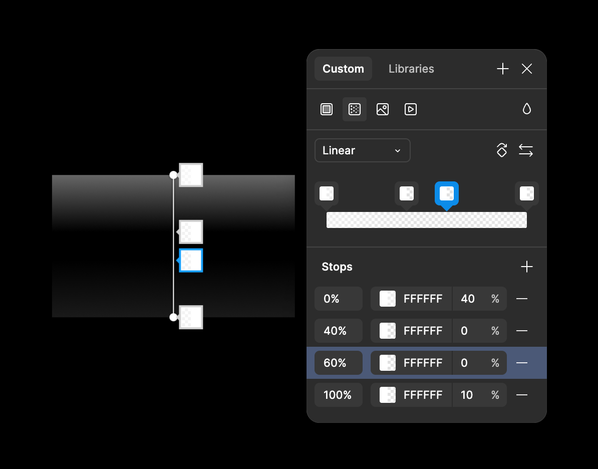
Instance of Gradient type we pass as the first parameter defines how different colors we pass into are represented along the LinearGradient.
You can try building gradients visually in Figma and play around with different combinations of stops and colors.
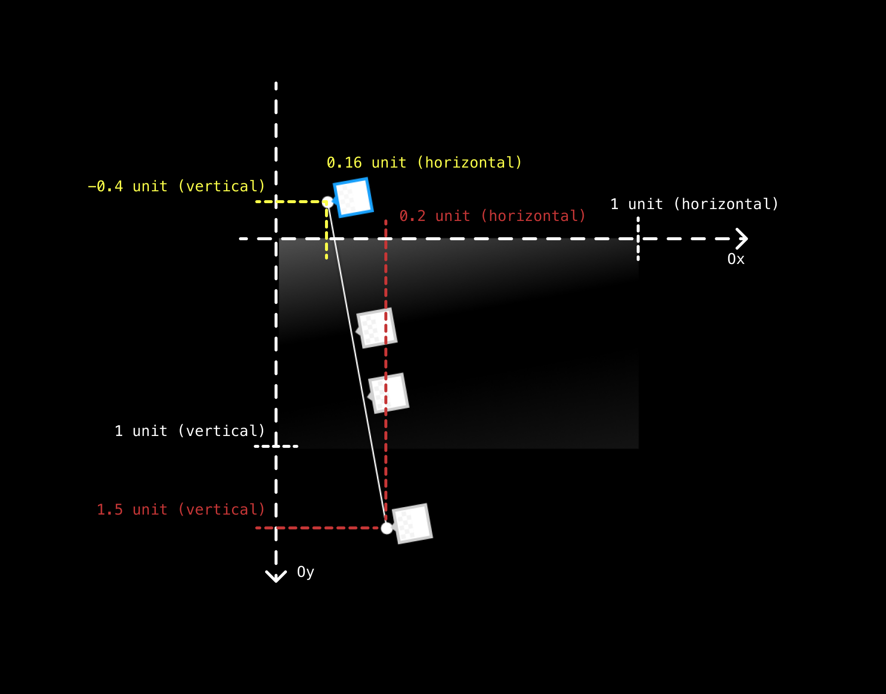
Unit points aren’t much harder. Unit is a normalized value in range from 0.0 to 1.0. Normalized means that it represents a relative value, not an absolute one.
For example, we have a shape that is 300 width and 400 height. A unit point (x: 0.2, y: 0.4) within this shape has absolute coordinates (x: 0.2 * 300, y: 0.4 * 400), or (x: 60, y: 160). Yes, to get the absolute value of a unit point, you simply multiply the corresponding coordinates.
Thus, startPoint represents the point where the linear gradient takes it’s origin, endPoint represents where it finishes. The image below shows the approximate location of the points.
To learn more about coordinate systems and their applications, read the Core Animation Programming Guide.
Moving further
If you look a little closer, you will see that the filling’s width is not constant along the border. That’s a drawback of having non-opaque colors in gradient and stroke together.
To fix it, we can apply strokeBorder modifier.
Capsule()
  .fill(.gray.opacity(0.25))
  .strokeBorder(
    LinearGradient(
      gradient: Gradient(stops: [
        .init(color: .white.opacity(0.4), location: 0.0),
        .init(color: .white.opacity(0.0), location: 0.4),
        .init(color: .white.opacity(0.0), location: 0.6),
        .init(color: .white.opacity(0.1), location: 1.0),
      ]),
      startPoint: .init(x: 0.16, y: -0.4),
      endPoint: .init(x: 0.2, y: 1.5)
    ),
    style: .init(lineWidth: 2)
  )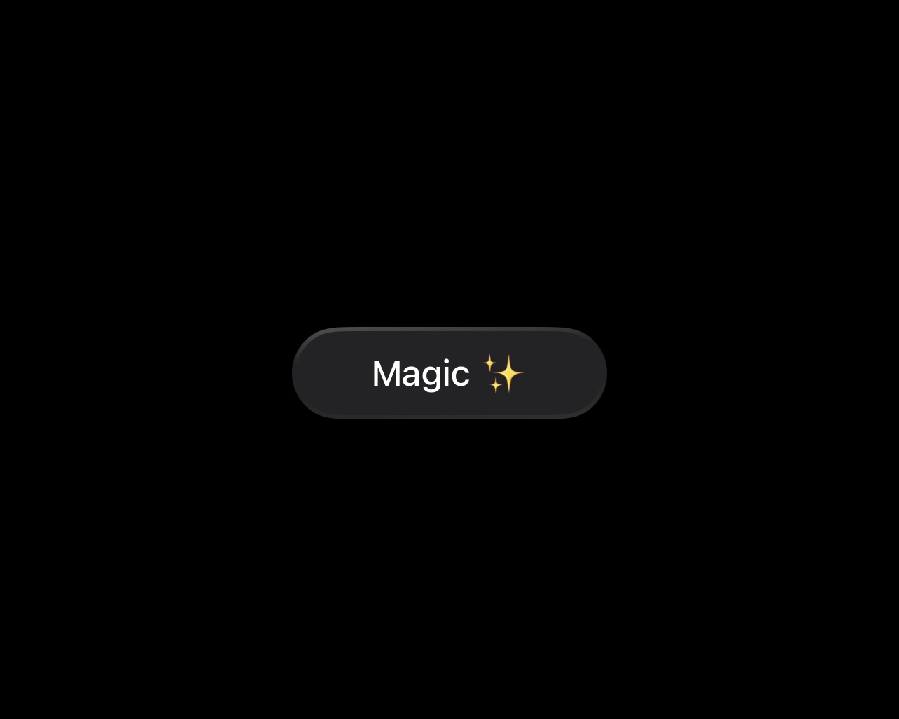
As the last stroke, let’s wrap this logic into a separate modifier, so in further it can be used with any shape and content.
extension View {
  @ViewBuilder
  func spatialWrap(
    _ shape: some InsettableShape,
    color: Color = Color.gray.opacity(0.25)
  ) -> some View {
    self
      .background {
        shape
          .fill(color)
          .strokeBorder(
            LinearGradient(
              gradient: Gradient(stops: [
                .init(color: .white.opacity(0.4), location: 0.0),
                .init(color: .white.opacity(0.0), location: 0.4),
                .init(color: .white.opacity(0.0), location: 0.6),
                .init(color: .white.opacity(0.1), location: 1.0),
              ]),
              startPoint: .init(x: 0.16, y: -0.4),
              endPoint: .init(x: 0.2, y: 1.5)
            ),
            style: .init(lineWidth: 2.0)
          )
      }
  }
}
With a thinner border, it looks even more elegant.

Where to go from here?
Imagination is perhaps the only limitation.
ZStack {
  Circle()
    .fill(.black.opacity(0.3))
    .strokeBorder(
      AngularGradient(
        gradient: Gradient(
          colors: [
            .black.opacity(0.25),
            .white,
            .black.opacity(0.25),
            .white,
            .black.opacity(0.25)
          ]
        ),
        center: .center,
        startAngle: .zero,
        endAngle: .degrees(360)
      ),
      style: .init(lineWidth: 3.0)
    )
    .strokeBorder(.black, style: .init(lineWidth: 1.0))
  Image(systemName: "arrow.up")
    .font(.system(size: 20.0, weight: .bold))
    .foregroundStyle(.white)
    .shadow(color: .black.opacity(0.4), radius: 0.0, y: -1.0)
}
.frame(width: 40.0)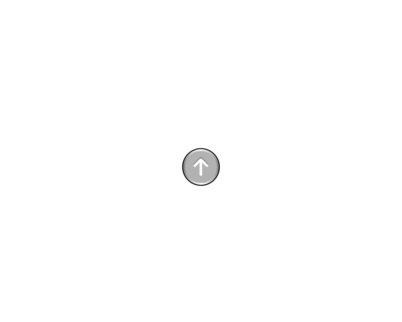
Thank you for reading! If you’re interested in iOS development, feel free to explore my other articles.
See you in the next experiments 🙌